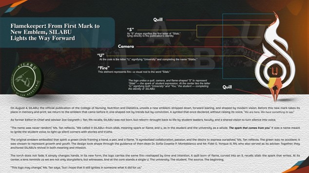

On August 4, SILABU, the official publication of the College of Nursing, Nutrition and Dietetics, unveils a new emblem: stripped down, forward leaning, and shaped by modern vision. Before this new mark takes its place in memory and print, we return to the emblem that came before it; one shaped not by trends but by conviction. A symbol that once declared, without raising its voice, “𝘞𝘦 𝘢𝘳𝘦 𝘩𝘦𝘳𝘦. 𝘞𝘦 𝘩𝘢𝘷𝘦 𝘴𝘰𝘮𝘦𝘵𝘩𝘪𝘯𝘨 𝘵𝘰 𝘴𝘢𝘺.”
As former Editor-in-Chief and adviser Zoe Gwyneth J. Tan, RN recalls, SILABU was not born, but reborn—brought back to life by student leaders, faculty, and a shared vision to turn silence into voice.
“The name was never random,” Ms. Tan reflects. “We called it SILABU—from silab, meaning spark or flame, and u, as in the student and the university as a whole. 𝙏𝙝𝙚 𝙨𝙥𝙖𝙧𝙠 𝙩𝙝𝙖𝙩 𝙘𝙤𝙢𝙚𝙨
𝙛𝙧𝙤𝙢 𝙮𝙤𝙪.” It was a name meant to ignite the student voice, to light up silent corners with stories and truths.
The original emblem embodied that spirit: a green circle framing a hand, a pen, and a flame. “It symbolized collaboration, passion, and the desire to express ourselves,” Ms. Tan reflects. The green was no accident; it was chosen to represent growth and youth. The design took shape through the guidance of then-dean Dr. Sofia Cosette P. Monteblanco and Mr. Fidel G. Yonque III, RN, who also served as its adviser. Together, they anchored SILABU’s revival in both meaning and mission.
The torch does not fade; it simply changes hands. In its new form, the logo carries the same fire—reshaped by time and intention. A quill born of flame, curved into an S, recalls silab: the spark that writes. At its center, a lens reminds us we are not only storytellers, but witnesses. And at the core stands a single U. The university. The student. The source. The beginning.
“This logo may change,” Ms. Tan says, “but I hope that it still ignites in someone what it did for us.”
𝗠𝗮𝘆 𝗶𝘁 𝗿𝗲𝗶𝗴𝗻𝗶𝘁𝗲 𝗶𝗻 𝘂𝘀 𝘄𝗵𝗮𝘁 𝘄𝗲 𝘁𝗵𝗼𝘂𝗴𝗵𝘁 𝘄𝗮𝘀 𝗹𝗼𝘀𝘁.